Flat Design Animation of Responsive Laptop and Mobile Devices
By animxplore4One great value subscription from €14.50/month
- Unlimited downloads of 27+ million creative assets
- AI Tools: video, image and more
- Lifetime commercial license
- Easy cancellation
Attributes
- Length
- 0:05
- Resolution
- 1920 x 1080
- File Size
- 37.1 MB
- Frame Rate
- 60 fps
- Alpha Channel
- Yes
- Looped
- Yes
- Video Encoding
- ProRes
- Orientation
- Horizontal
- Commercial License
- Further Information
Description
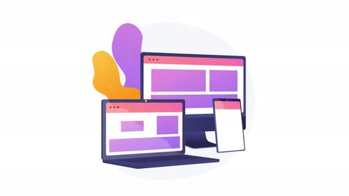
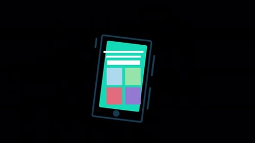
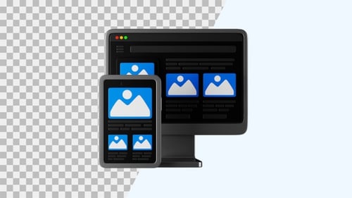
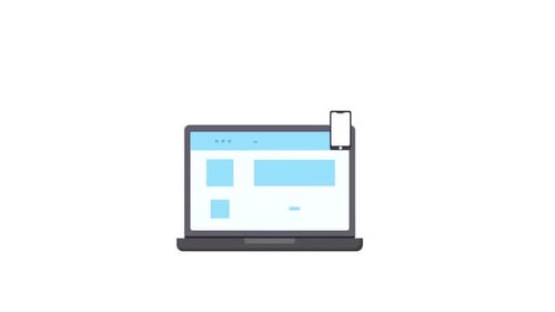
This animated clip showcases a laptop appearing from below, followed by a smartphone sliding in from the side. Both devices feature clean, flat design interfaces depicting abstract web content and mobile application layouts. The animation concludes with a subtle tilt, emphasizing connectivity and responsive design across different screens. This visual effect is ideal for explaining digital concepts, software development, multi-device compatibility, or illustrating modern technology workflows with a sleek, minimalist aesthetic.