Responsive Web Design Across Multiple Devices Animation
By GraphiqaOne great value subscription from €14.50/month
- Unlimited downloads of 27+ million creative assets
- AI Tools: video, image and more
- Lifetime commercial license
- Easy cancellation
Attributes
- Length
- 0:06
- Resolution
- 3840 x 2160
- File Size
- 216 MB
- Frame Rate
- 29.97 fps
- Alpha Channel
- Yes
- Looped
- Yes
- Video Encoding
- ProRes
- Orientation
- Horizontal
- Commercial License
- Further Information
Description
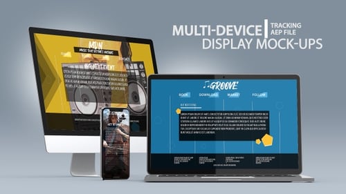
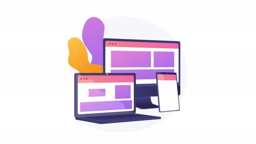
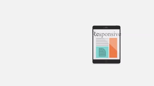
This animated graphic visually demonstrates the concept of responsive web design across various digital devices. Featuring a clean, flat design style, it showcases a mobile phone, tablet, desktop computer, and laptop all displaying adapted website layouts, interconnected by dynamic lines. A global icon and design tools further emphasize the universal and structured nature of web development. This versatile animation is ideal for corporate presentations, technology explainers, digital marketing content, educational videos, and business-focused projects that highlight adaptability and seamless user experience across platforms.