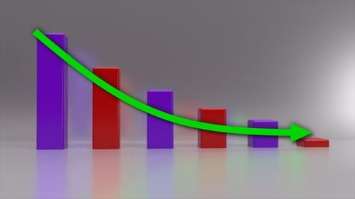
3D Bar Chart Animation with Decreasing Data Trend
By PixelsMagicOne great value subscription from €14.50/month
- Unlimited downloads of 27+ million creative assets
- AI Tools: video, image and more
- Lifetime commercial license
- Easy cancellation
Attributes
- Length
- 0:04
- Resolution
- 1920 x 1080
- File Size
- 172 MB
- Frame Rate
- 30 fps
- Alpha Channel
- No
- Looped
- Yes
- Video Encoding
- ProRes
- Orientation
- Horizontal
- Commercial License
- Further Information
Description
A 3D bar graph featuring alternating purple and red bars animates upwards to visualize data. A prominent green arrow then descends across the graph, clearly indicating a negative or decreasing trend over successive data points. This clean, professional, and modern animation is ideal for enhancing business presentations, financial reports, or educational content. It efficiently communicates statistical changes, making complex information easily digestible and engaging. Perfect for corporate videos, explainer content, or any project requiring dynamic data representation or trend analysis.